進化学実習 2022 牧野研
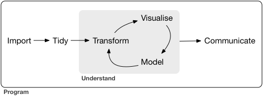
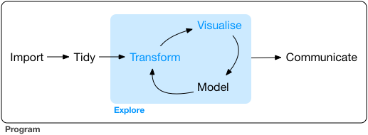
2. データの可視化
データ解析のおおまかな流れ
- コンピュータ環境の整備
- データの取得、読み込み
- 探索的データ解析
- 前処理、加工 (地味。意外と重い) 👈次回
- 可視化、仮説生成 (派手!楽しい!) 👈今回
- 統計解析、仮説検証 (みんな勉強したがる)
- 報告、発表
そもそもなぜ解析? 生の数字見ればよくない?
生データは情報が多すぎて関係性も何も見えない
print(diamonds)
      carat       cut color clarity depth table price     x     y     z
      <dbl>     <ord> <ord>   <ord> <dbl> <dbl> <int> <dbl> <dbl> <dbl>
    1  0.23     Ideal     E     SI2  61.5    55   326  3.95  3.98  2.43
    2  0.21   Premium     E     SI1  59.8    61   326  3.89  3.84  2.31
    3  0.23      Good     E     VS1  56.9    65   327  4.05  4.07  2.31
    4  0.29   Premium     I     VS2  62.4    58   334  4.20  4.23  2.63
   --
53937  0.72      Good     D     SI1  63.1    55  2757  5.69  5.75  3.61
53938  0.70 Very Good     D     SI1  62.8    60  2757  5.66  5.68  3.56
53939  0.86   Premium     H     SI2  61.0    58  2757  6.15  6.12  3.74
53940  0.75     Ideal     D     SI2  62.2    55  2757  5.83  5.87  3.64
ダイヤモンド53,940個について10項目の値を持つ data.frame
要約統計量(平均とか分散とか)を見てみる
各列の平均とか標準偏差とか:
   stat carat depth table    price     x     y     z
  <chr> <dbl> <dbl> <dbl>    <dbl> <dbl> <dbl> <dbl>
1  mean  0.80 61.75 57.46  3932.80  5.73  5.73  3.54
2    sd  0.47  1.43  2.23  3989.44  1.12  1.14  0.71
3   max  5.01 79.00 95.00 18823.00 10.74 58.90 31.80
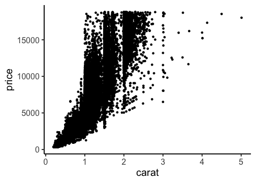
大きさ carat と価格 price の相関係数は 0.92 (かなり高い)。
生のままよりは把握しやすいかも。
しかし要注意…
平均値ばかり見て可視化を怠ると構造を見逃す
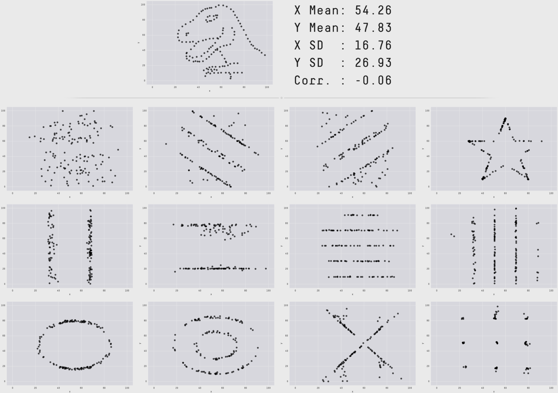
作図してみると全体像・構造が見やすい
情報の整理 → 正しい解析・新しい発見・仮説生成
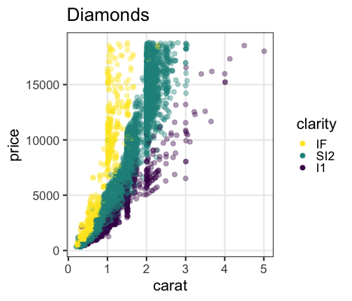
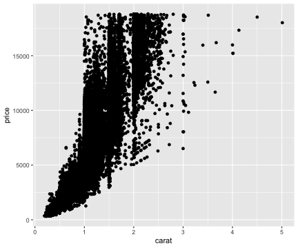
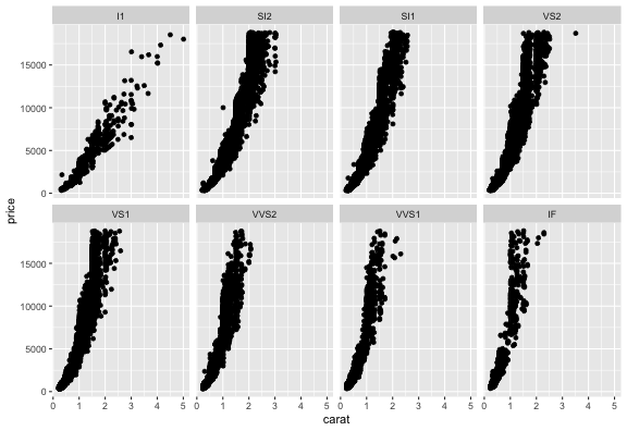
carat が大きいほど price も高いらしい。
その度合いは clarity によって異なるらしい。
作図してみると全体像・構造が見やすい
情報の整理 → 正しい解析・新しい発見・仮説生成

そうは言ってもセンスでしょ? — NO!


ある程度はテクニックであり教養。
デザインの基本的なルールを
知りさえすれば誰でも上達する。

同じデータでも見せ方で印象が変わる
平均値の差? ばらつきの様子? 軸はゼロから始まる?
目的に合わせて見せ方を吟味しよう。
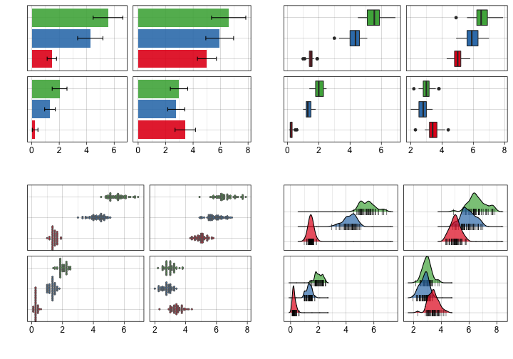
こんな感じの図もRでラクラク描けるよ
本日2時限目の話題: Rによるデータ可視化
✅ データ解析全体の流れ。可視化だいじ
⬜ 一貫性のある文法で合理的に描けるggplot2
⬜ 画像出力まできっちりプログラミング
これから可視化する data.frame
iris はアヤメ属3種150個体に関する測定データ。
Rに最初から入ってて、例としてよく使われる。
print(iris)
    Sepal.Length Sepal.Width Petal.Length Petal.Width   Species
           <dbl>       <dbl>        <dbl>       <dbl>     <fct>
  1          5.1         3.5          1.4         0.2    setosa
  2          4.9         3.0          1.4         0.2    setosa
  3          4.7         3.2          1.3         0.2    setosa
  4          4.6         3.1          1.5         0.2    setosa
 --
147          6.3         2.5          5.0         1.9 virginica
148          6.5         3.0          5.2         2.0 virginica
149          6.2         3.4          5.4         2.3 virginica
150          5.9         3.0          5.1         1.8 virginica
長さ150の数値ベクトル4本と因子ベクトル1本。
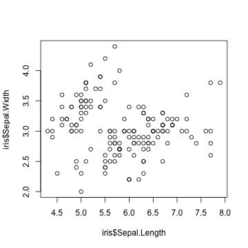
R標準のグラフィックス
描けるっちゃ描けるけど。カスタマイズしていくのは難しい。
plot(iris$Sepal.Length, iris$Sepal.Width)
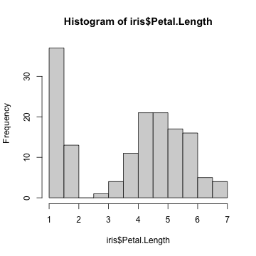
R標準のグラフィックス
描けるっちゃ描けるけど。カスタマイズしていくのは難しい。
hist(iris$Petal.Length)
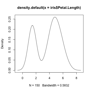
R標準のグラフィックス
描けるっちゃ描けるけど。カスタマイズしていくのは難しい。
plot(density(iris$Petal.Length))
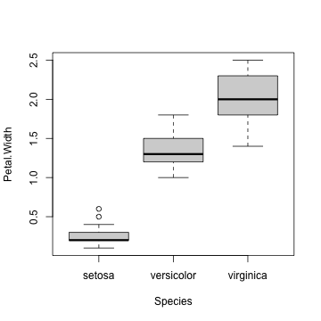
R標準のグラフィックス
描けるっちゃ描けるけど。カスタマイズしていくのは難しい。
boxplot(Petal.Width ~ Species, data = iris)
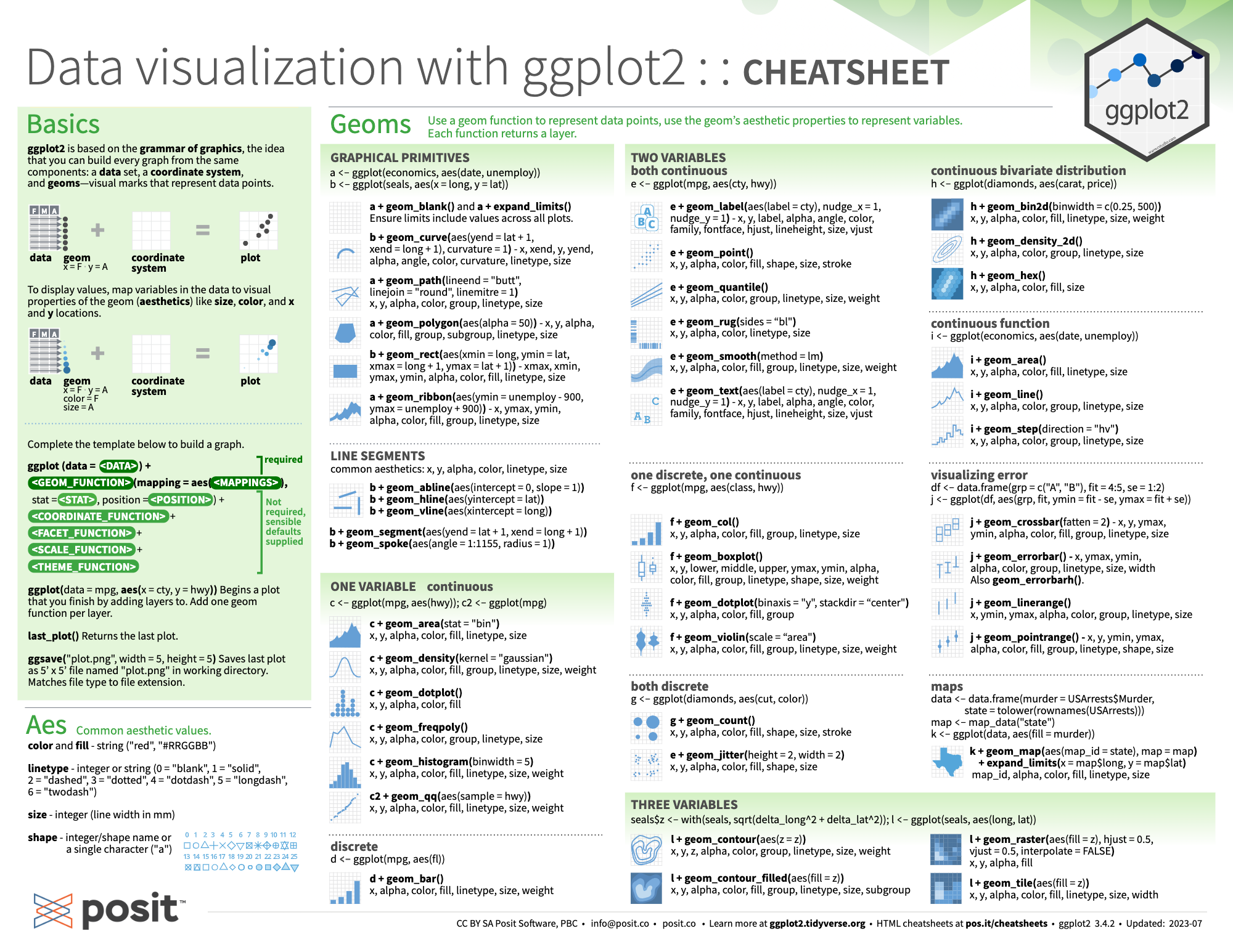
きれいなグラフを簡単に描けるパッケージを使いたい。
ggplot2
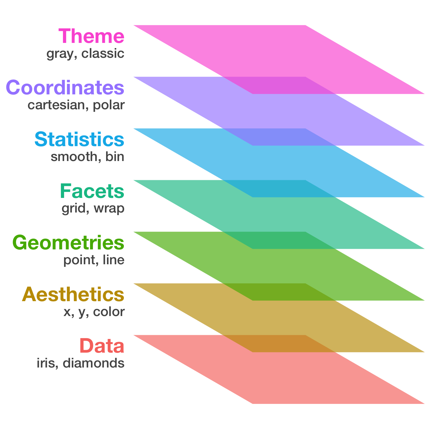
- tidyverseパッケージ群のひとつ
- “The Grammar of Graphics” という体系に基づく設計
- 単にいろんなグラフを「描ける」だけじゃなく
一貫性のある文法で合理的に描ける


いきなりggplot2から使い始めても大丈夫
R標準のやつとは根本的に違うシステムで作図する。

基本的な使い方: 指示を + で重ねていく
基本的な使い方: 指示を + で重ねていく
ggplot(data = diamonds)             # diamondsデータでキャンバス準備
# aes(x = carat, y = price) +       # carat,price列をx,y軸にmapping
# geom_point() +                    # 散布図を描く
# facet_wrap(vars(clarity)) +       # clarity列に応じてパネル分割
# stat_smooth(method = lm) +        # 直線回帰を追加
# coord_cartesian(ylim = c(0, 2e4)) + # y軸の表示範囲を狭く
# theme_classic(base_size = 20)     # クラシックなテーマで

基本的な使い方: 指示を + で重ねていく
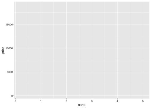
ggplot(data = diamonds) +           # diamondsデータでキャンバス準備
  aes(x = carat, y = price)         # carat,price列をx,y軸にmapping
# geom_point() +                    # 散布図を描く
# facet_wrap(vars(clarity)) +       # clarity列に応じてパネル分割
# stat_smooth(method = lm) +        # 直線回帰を追加
# coord_cartesian(ylim = c(0, 2e4)) + # y軸の表示範囲を狭く
# theme_classic(base_size = 20)     # クラシックなテーマで
基本的な使い方: 指示を + で重ねていく
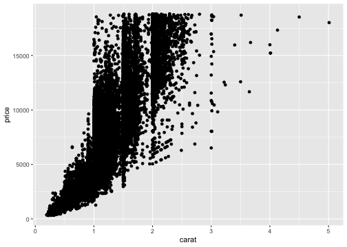
ggplot(data = diamonds) +           # diamondsデータでキャンバス準備
  aes(x = carat, y = price) +       # carat,price列をx,y軸にmapping
  geom_point()                      # 散布図を描く
# facet_wrap(vars(clarity)) +       # clarity列に応じてパネル分割
# stat_smooth(method = lm) +        # 直線回帰を追加
# coord_cartesian(ylim = c(0, 2e4)) + # y軸の表示範囲を狭く
# theme_classic(base_size = 20)     # クラシックなテーマで
基本的な使い方: 指示を + で重ねていく
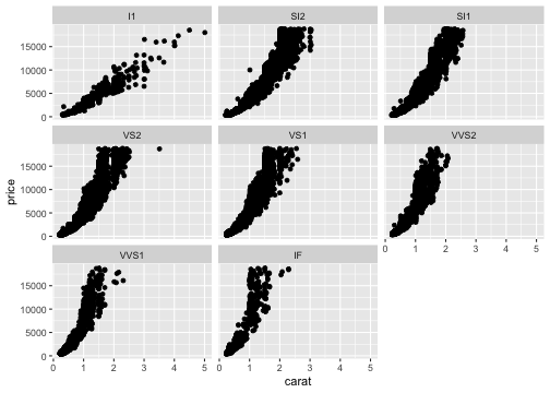
ggplot(data = diamonds) +           # diamondsデータでキャンバス準備
  aes(x = carat, y = price) +       # carat,price列をx,y軸にmapping
  geom_point() +                    # 散布図を描く
  facet_wrap(vars(clarity))         # clarity列に応じてパネル分割
# stat_smooth(method = lm) +        # 直線回帰を追加
# coord_cartesian(ylim = c(0, 2e4)) + # y軸の表示範囲を狭く
# theme_classic(base_size = 20)     # クラシックなテーマで
基本的な使い方: 指示を + で重ねていく
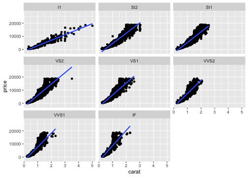
ggplot(data = diamonds) +           # diamondsデータでキャンバス準備
  aes(x = carat, y = price) +       # carat,price列をx,y軸にmapping
  geom_point() +                    # 散布図を描く
  facet_wrap(vars(clarity)) +       # clarity列に応じてパネル分割
  stat_smooth(method = lm)          # 直線回帰を追加
# coord_cartesian(ylim = c(0, 2e4)) + # y軸の表示範囲を狭く
# theme_classic(base_size = 20)     # クラシックなテーマで
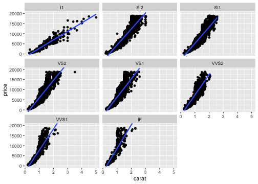
基本的な使い方: 指示を + で重ねていく
ggplot(data = diamonds) +           # diamondsデータでキャンバス準備
  aes(x = carat, y = price) +       # carat,price列をx,y軸にmapping
  geom_point() +                    # 散布図を描く
  facet_wrap(vars(clarity)) +       # clarity列に応じてパネル分割
  stat_smooth(method = lm) +        # 直線回帰を追加
  coord_cartesian(ylim = c(0, 2e4))   # y軸の表示範囲を狭く
# theme_classic(base_size = 20)     # クラシックなテーマで
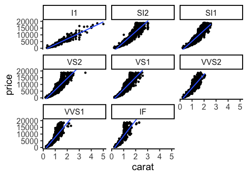
基本的な使い方: 指示を + で重ねていく
ggplot(data = diamonds) +           # diamondsデータでキャンバス準備
  aes(x = carat, y = price) +       # carat,price列をx,y軸にmapping
  geom_point() +                    # 散布図を描く
  facet_wrap(vars(clarity)) +       # clarity列に応じてパネル分割
  stat_smooth(method = lm) +        # 直線回帰を追加
  coord_cartesian(ylim = c(0, 2e4)) + # y軸の表示範囲を狭く
  theme_classic(base_size = 20)     # クラシックなテーマで
基本的な使い方: 指示を + で重ねていく
ggplot(data = diamonds) +           # diamondsデータでキャンバス準備
  aes(x = carat, y = price) +       # carat,price列をx,y軸にmapping
  geom_point() +                    # 散布図を描く
# facet_wrap(vars(clarity)) +       # clarity列に応じてパネル分割
# stat_smooth(method = lm) +        # 直線回帰を追加
# coord_cartesian(ylim = c(0, 2e4)) + # y軸の表示範囲を狭く
  theme_classic(base_size = 20)     # クラシックなテーマで
途中経過オブジェクトを取っておける
p1 = ggplot(data = diamonds)
p2 = p1 + aes(x = carat, y = price)
p3 = p2 + geom_point()
p4 = p3 + facet_wrap(vars(clarity))
print(p3)
普段はあんまりやらなけど、今日は後で p3 とか使う
ひとまずggplotしてみよう
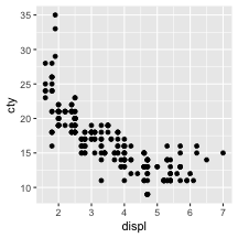
自動車のスペックに関するデータ mpg を使って。
    manufacturer  model displ  year   cyl      trans   drv   cty   hwy    fl   class
           <chr>  <chr> <dbl> <int> <int>      <chr> <chr> <int> <int> <chr>   <chr>
  1         audi     a4   1.8  1999     4   auto(l5)     f    18    29     p compact
  2         audi     a4   1.8  1999     4 manual(m5)     f    21    29     p compact
 --
233   volkswagen passat   2.8  1999     6 manual(m5)     f    18    26     p midsize
234   volkswagen passat   3.6  2008     6   auto(s6)     f    17    26     p midsize
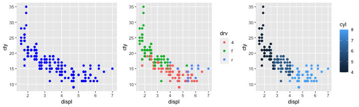
🔰 排気量 displ と市街地燃費 cty の関係を散布図で。
よくあるエラー
関数名を ggplot2 と書いちゃうと勘違い:
> ggplot2(diamonds)
Error in ggplot2(diamonds) : could not find function "ggplot2"
ggplot2 はパッケージ名。
今度こそ関数名は合ってるはずなのに…
> ggplot(diamonds)
Error in ggplot(diamonds) : could not find function "ggplot"
パッケージ読み込みを忘れてた。新しくRを起動するたびに必要:
library(tidyverse)  # including ggplot2
ggplot(diamonds)    # OK!
そのほか よくあるエラー集 (石川由希さん@名古屋大) を参照。
ggplot() に渡すのは整然データ tidy data
- 1行は1つの観測
- 1列は1つの変数
- 1セルは1つの値
- この列をX軸、この列をY軸、この列で色わけ、と指定できる!
print(diamonds)
      carat       cut color clarity depth table price     x     y     z
      <dbl>     <ord> <ord>   <ord> <dbl> <dbl> <int> <dbl> <dbl> <dbl>
    1  0.23     Ideal     E     SI2  61.5    55   326  3.95  3.98  2.43
    2  0.21   Premium     E     SI1  59.8    61   326  3.89  3.84  2.31
    3  0.23      Good     E     VS1  56.9    65   327  4.05  4.07  2.31
    4  0.29   Premium     I     VS2  62.4    58   334  4.20  4.23  2.63
   --
53937  0.72      Good     D     SI1  63.1    55  2757  5.69  5.75  3.61
53938  0.70 Very Good     D     SI1  62.8    60  2757  5.66  5.68  3.56
53939  0.86   Premium     H     SI2  61.0    58  2757  6.15  6.12  3.74
53940  0.75     Ideal     D     SI2  62.2    55  2757  5.83  5.87  3.64
https://r4ds.hadley.nz/data-tidy.html; https://speakerdeck.com/fnshr/zheng-ran-detatutenani
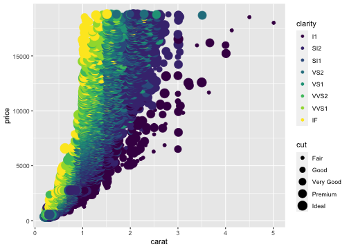
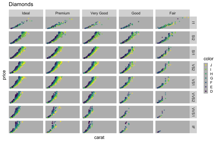
Aesthetic mapping でデータと見せ方を紐付け
aes() の中で列名を指定する。
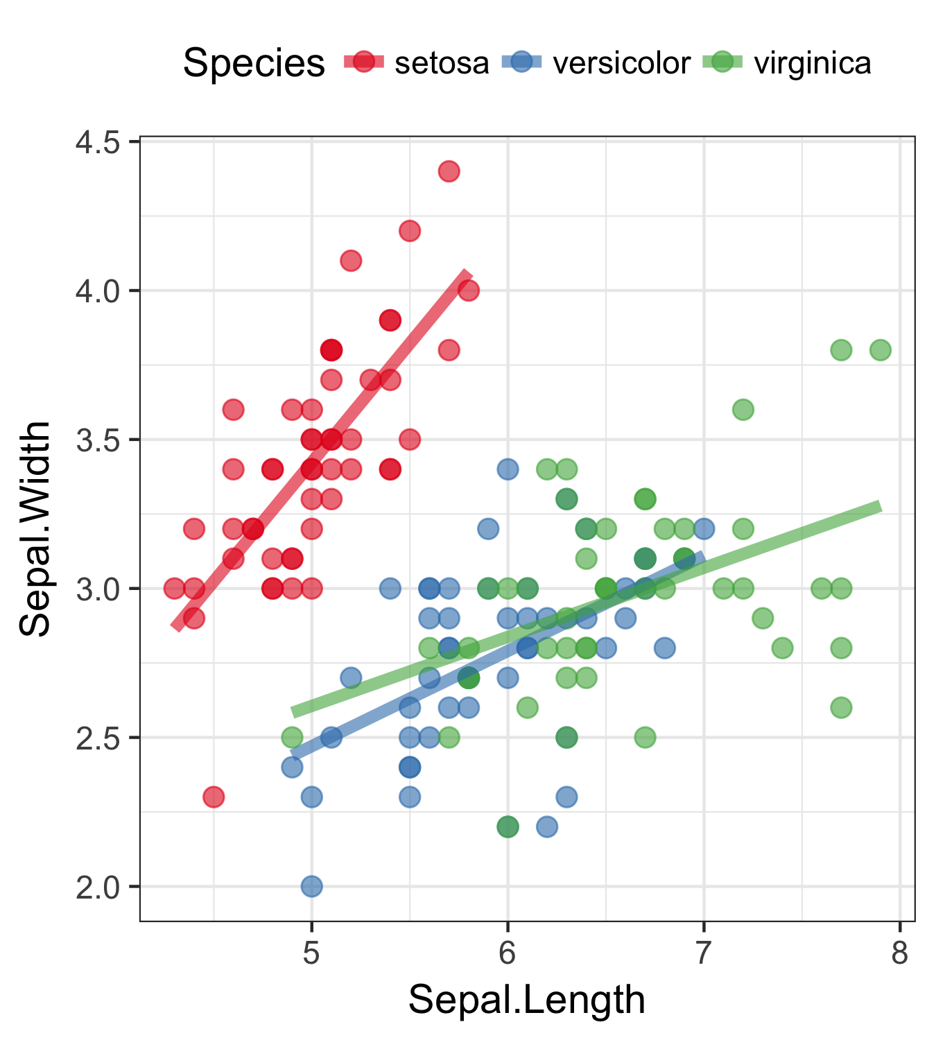
ggplot(diamonds) +
  aes(x = carat, y = price) +
  geom_point(mapping = aes(color = clarity, size = cut))
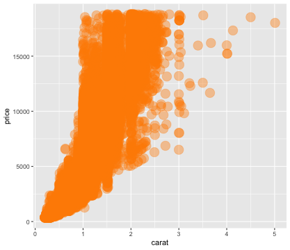
データによらず一律でaestheticsを変える
aes() の外で値を指定する。
ggplot(diamonds) +
  aes(x = carat, y = price) +
  geom_point(color = "darkorange", size = 6, alpha = 0.4)
色の変え方の練習
自動車のスペックに関するデータ mpg を使って。
    manufacturer  model displ  year   cyl      trans   drv   cty   hwy    fl   class
           <chr>  <chr> <dbl> <int> <int>      <chr> <chr> <int> <int> <chr>   <chr>
  1         audi     a4   1.8  1999     4   auto(l5)     f    18    29     p compact
  2         audi     a4   1.8  1999     4 manual(m5)     f    21    29     p compact
 --
233   volkswagen passat   2.8  1999     6 manual(m5)     f    18    26     p midsize
234   volkswagen passat   3.6  2008     6   auto(s6)     f    17    26     p midsize
🔰 排気量 displ と市街地燃費 cty の関係を青い散布図で描こう
🔰 駆動方式 drv やシリンダー数 cyl によって色を塗り分けしてみよう
aesthetics一覧
点と線と文字は color, 面は fill
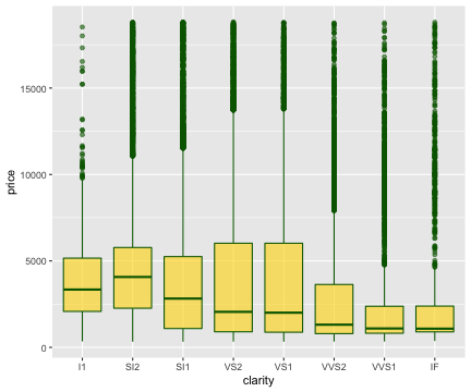
ggplot(diamonds) +
  aes(clarity, price) +
  geom_boxplot(color = "darkgreen", fill = "gold", alpha = 0.6)
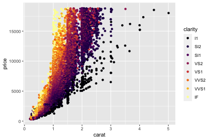
色パレットの変更 scale_color_*()
個々の色を自分で決めず、既存のパレットを利用するのが吉。
e.g., viridis,
ColorBrewer
(色覚多様性・グレースケール対策にも有効)
ggplot(diamonds) + aes(carat, price) +
  geom_point(mapping = aes(color = clarity)) +
  scale_color_viridis_d(option = "inferno")
# scale_color_brewer(palette = "Spectral")
連続値(continuous)と離散値(discrete)を区別する
渡す値とscale関数が合ってないと怒られる:
Error: Continuous value supplied to discrete scale
ggplot(diamonds) + aes(carat, price) +
  geom_point(mapping = aes(color = price)) +
  scale_color_viridis_c(option = "inferno")
# scale_color_distiller(palette = "Spectral")
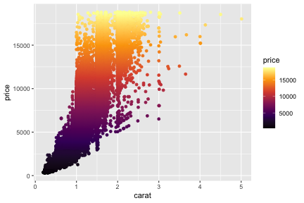
- discrete:
scale_color_viridis_d(),scale_color_brewer() - continuous:
scale_color_viridis_c(),scale_color_distiller() - binned:
scale_color_viridis_b(),scale_color_fermenter()
値に応じてパネル切り分け (1変数facet)
ggplotの真骨頂! これをR標準機能でやるのは結構たいへん。
p3 + facet_wrap(vars(clarity), ncol = 4L)
値に応じてパネル切り分け (≥2変数facet)
ggplotの真骨頂! これをR標準機能でやるのは結構たいへん。
p3 + facet_grid(vars(clarity), vars(cut))
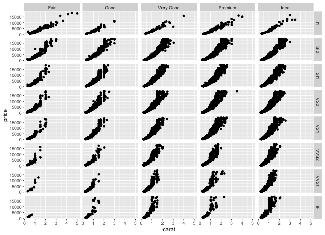
多変量データの俯瞰、5次元くらいまで有効
値に応じたfacetの練習
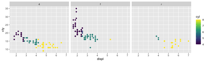
自動車のスペックに関するデータ mpg を使って。
    manufacturer  model displ  year   cyl      trans   drv   cty   hwy    fl   class
           <chr>  <chr> <dbl> <int> <int>      <chr> <chr> <int> <int> <chr>   <chr>
  1         audi     a4   1.8  1999     4   auto(l5)     f    18    29     p compact
  2         audi     a4   1.8  1999     4 manual(m5)     f    21    29     p compact
 --
233   volkswagen passat   2.8  1999     6 manual(m5)     f    18    26     p midsize
234   volkswagen passat   3.6  2008     6   auto(s6)     f    17    26     p midsize
🔰 駆動方式 drv やシリンダー数 cyl によってfacetしてみよう
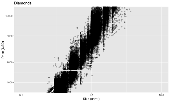
値を変えず座標軸を変える scale_*, coord_*
p2 + geom_point(alpha = 0.25) +
  scale_x_log10() +
  scale_y_log10(breaks = c(1, 2, 5, 10) * 1000) +
  coord_cartesian(xlim = c(0.1, 10), ylim = c(800, 12000)) +
  labs(title = "Diamonds", x = "Size (carat)", y = "Price (USD)")
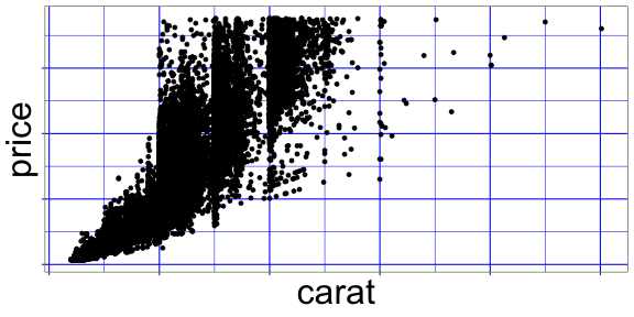
データと関係ない部分の見た目を調整 theme
既存の theme_*()
をベースに、theme()関数で微調整。
p3 + theme_bw() + theme(
  panel.background = element_rect(fill = "white"), # 箱
  panel.grid       = element_line(color = "blue"), # 線
  axis.title       = element_text(size = 32),      # 文字
  axis.text        = element_blank()               # 消す
)
基本的な使い方: 指示を + で重ねていく
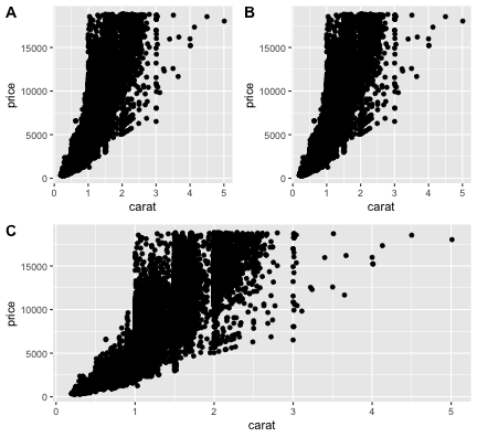
論文のFigureみたいに並べる
別のパッケージ (cowplot や patchwork) の助けを借りて
pAB = cowplot::plot_grid(p3, p3, labels = c("A", "B"), nrow = 1L)
cowplot::plot_grid(pAB, p3, labels = c("", "C"), ncol = 1L)
ファイル名もサイズも再現可能な作図
widthやheightが小さいほど、文字・点・線が相対的に大きく
# 7inch x 300dpi = 2100px四方 (デフォルト)
ggsave("dia1.png", p3) # width = 7, height = 7, dpi = 300
# 4     x 300    = 1200  全体7/4倍ズーム
ggsave("dia2.png", p3, width = 4, height = 4) # dpi = 300
# 2     x 600    = 1200  全体をさらに2倍ズーム
ggsave("dia3.png", p3, width = 2, height = 2, dpi = 600)
# 4     x 300    = 1200  テーマを使って文字だけ拡大
ggsave("dia4.png", p3 + theme_bw(base_size = 22), width = 4, height = 4)
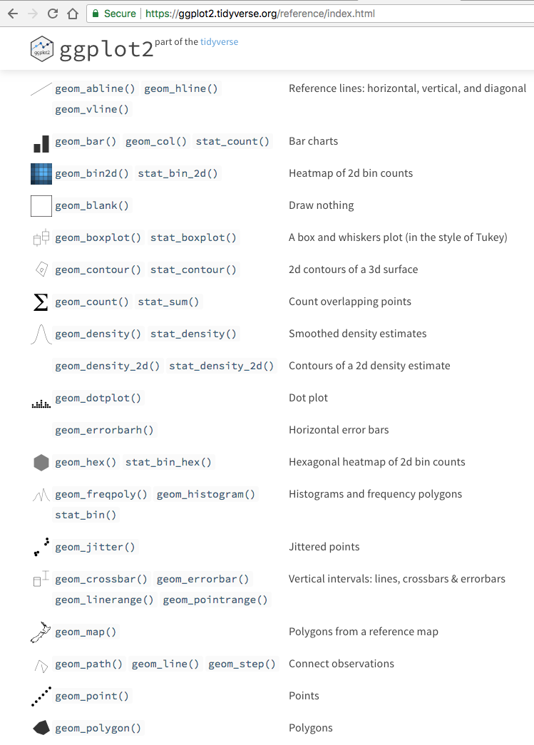
他にどんな種類の geom_*() が使える?
なんでもある。 公式サイトを見に行こう。
微調整してくと最終的に長いコードになるね…
うん。でもすべての点について後から確認できるし、使い回せる!
ggplot(diamonds) +
  geom_boxplot(aes(y = carat, x = cut, color = cut)) +
  theme_classic(base_size = 15) +
  coord_cartesian(ylim = c(-1, 6)) +
  labs(title = "Diamonds", x = "Size (carat)", y = "Price (USD)") +
  theme(axis.title.x = element_text(color = "black", size = 30),
        axis.title.y = element_text(color = "black", size = 30),
        axis.text.x = element_blank(),
        axis.text.y = element_text(color = "black", size = 30),
        axis.line.x = element_line(),
        axis.line.y = element_line(),
        axis.ticks.length = unit(8, "pt"),
        panel.background = element_blank(),
        panel.grid.major = element_blank(),
        panel.grid.minor = element_blank(),
        legend.position = "none",
        plot.margin = grid::unit(c(0.5, 0.5, 1, 0.5), "lines"))
発展的な内容
- ggplot2をさらに拡張するパッケージも続々
- アニメーション gganimate
- 重なりを避けてラベル付け ggrepel
- グラフ/ネットワーク ggraph
- 系統樹 ggtree
- 地図
geom_sf - 学術論文向けのいろいろ ggpubr
本日2時限目の話題: Rによるデータ可視化
✅ まずデータ全体を可視化してみるのがだいじ
✅ 一貫性のある文法で合理的に描けるggplot2
✅ 画像出力まできっちりプログラミング
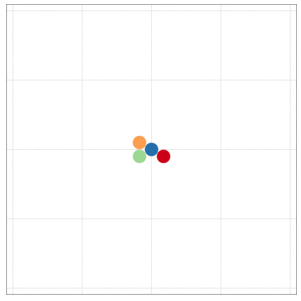
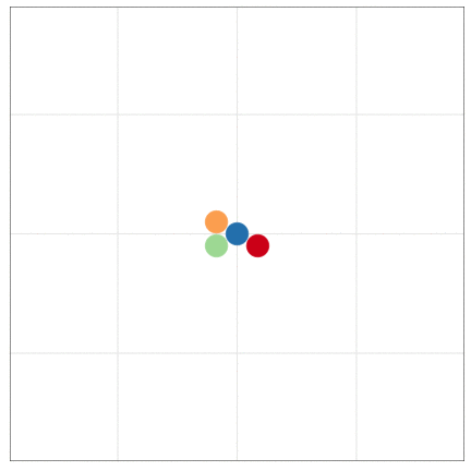
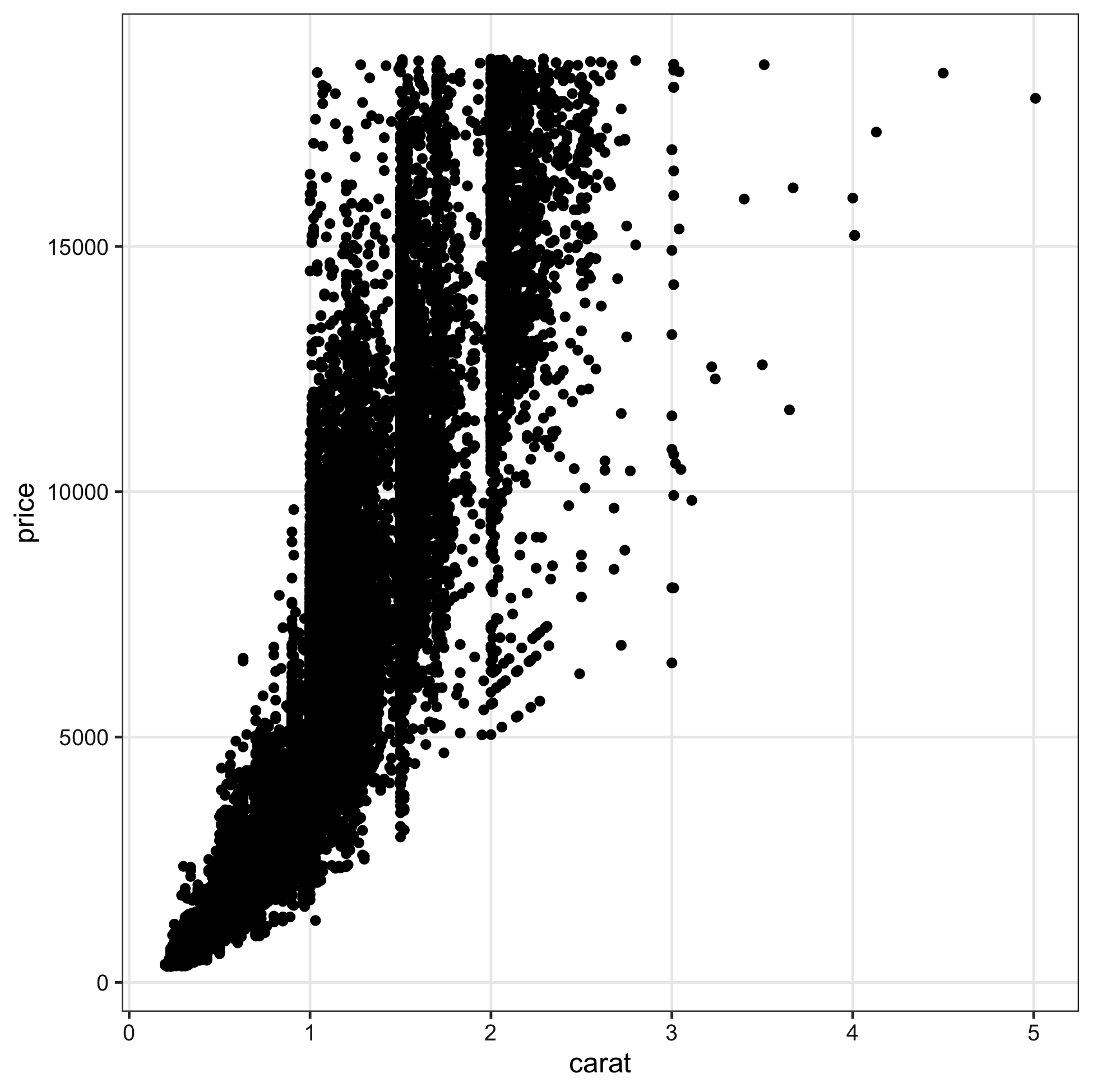
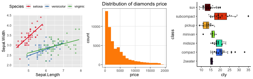
🔰 1日目の課題
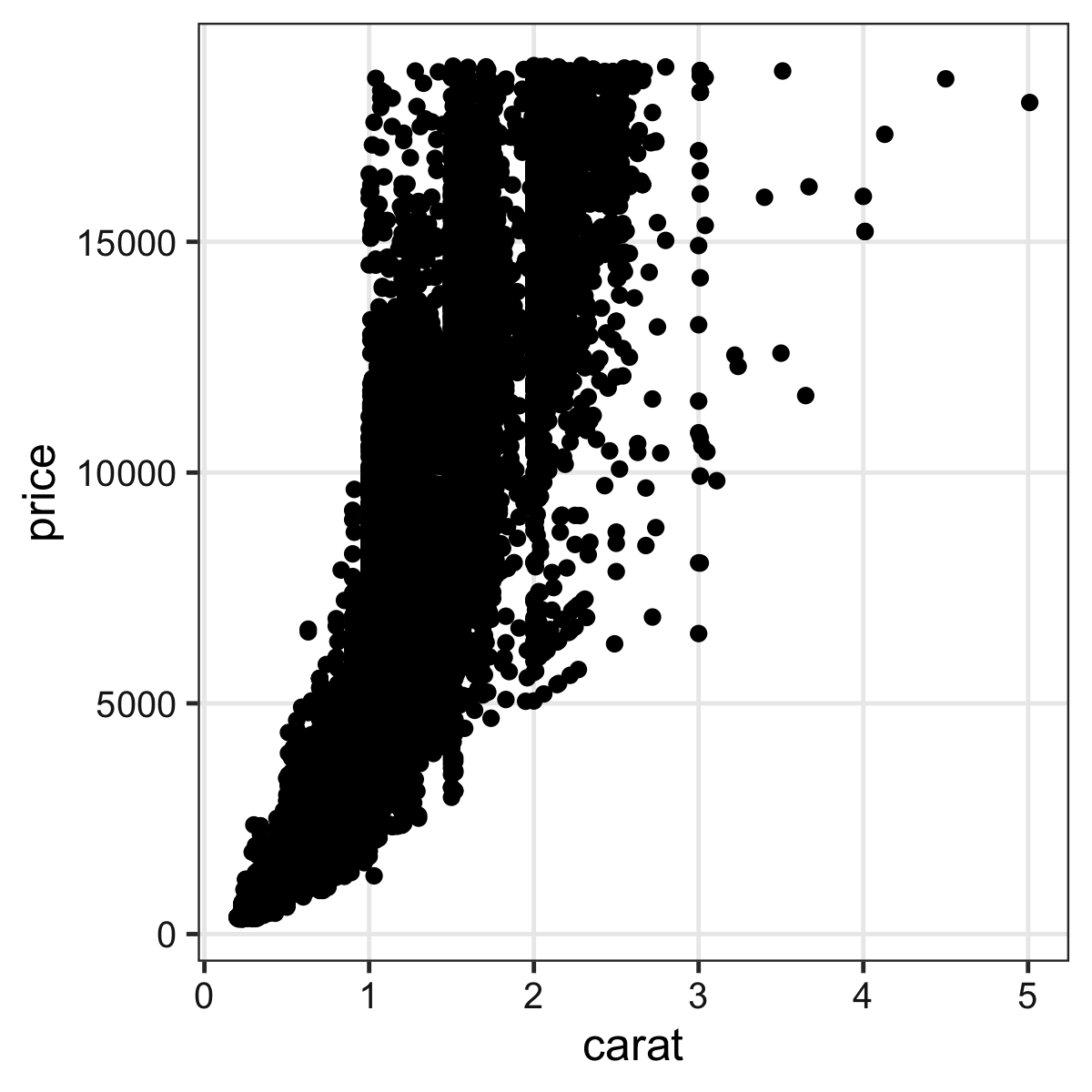
下図になるべく似るように調整して ggsave() してください。
次回、グループに分かれてコードと図を見せ合います。
🔰 自由課題
公式サイトや解説ブログなどを参考にいろいろな関数・オプションを試そう。
次回、時間が許すかぎり画面共有でコードと図を紹介してもらいます。
- 図の意義や独創性は置いておいて「描きたいものが描ける」を目指す。
- 「講義で紹介されなかったこのオプションが便利」
「ホントはこうしたかったけど方法が見つからなかった」
などのコメント・質問が多く出ることを期待します。
参考
- R for Data Science — Hadley Wickham and Garrett Grolemund
- https://r4ds.had.co.nz/
- Book
- 日本語版書籍(Rではじめるデータサイエンス)
- Older versions
- 「Rにやらせて楽しよう — データの可視化と下ごしらえ」 岩嵜航 2018
- 「Rを用いたデータ解析の基礎と応用」石川由希 2019 名古屋大学
- 「Rによるデータ前処理実習」 岩嵜航 2020 東京医科歯科大
- 「Rを用いたデータ解析の基礎と応用」 石川由希 2021 名古屋大学
- ggplot2公式ドキュメント
- https://ggplot2.tidyverse.org/